| Select Chart List: | |
| Jump to: |

| Select Chart List: | |
| Jump to: |
June was the last month that we posted our weekly Covid-19 updates. Of course, the global fight against Covid-19 is far from over. But, the U.S. trend for daily cases and deaths has been steadily decreasing as an ever-greater percentage of the population is vaccinated. For more information, click here.
At MDmetrix, we will continue empowering clinical leaders to transform care as they navigate recovery from the pandemic. Today, hospitals and surgery centers are using MDmetrix's unique clinical management system to drive dramatic capacity and efficiency improvements, as they respond to the Covid-19 financial crisis. At the same time, we are excited to see clinicians leveraging MDmetrix to dramatically improve care quality and equity. If you would be interested in seeing a demo of MDmetrix, please reach out to our team. Case studies and other information are also available at www.mdmetrix.com.
Each chart has a centerline (mean), upper control limit (top dotted line), lower control limit (lower dotted line). The daily fluctuations can either be 'common cause variation' or noise within the system, or can be considered 'special cause variation' which is a data signal that something has changed in the system.
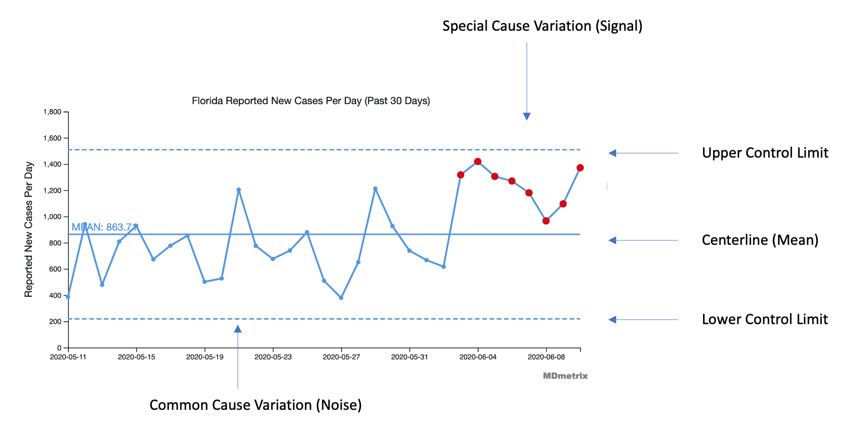
There are established mathematical rules for these signals e.g. breach of the control limits, 6 sequential points ascending or descending, 8 sequential points the same side of the centerline. These data signals indicate system is improving or deteriorating and are highlighted in red.
All data regarding national- and state-wide COVID-19 trends are based on available daily deaths and new case counts data from The New York Times. MDmetrix’s artificial intelligence automatically identifies changes or “signals” in the data so that leaders and front line clinicians can understand and adapt their approaches to COVID-19.